I redesigned the core of the business boosting rate to conversion and increasing gross booking volume by $160 million


My role
Team
Product manager
Front-End Engineers
Back-End Engineers
Goals
Redesign with decision critical pieces only
Increase confidence in booking for property and room
Increase PDP to Checkout conversion
Non-goals
Redesign for the sake of aesthetics only
Discovery and definition

Understand the root of the problem
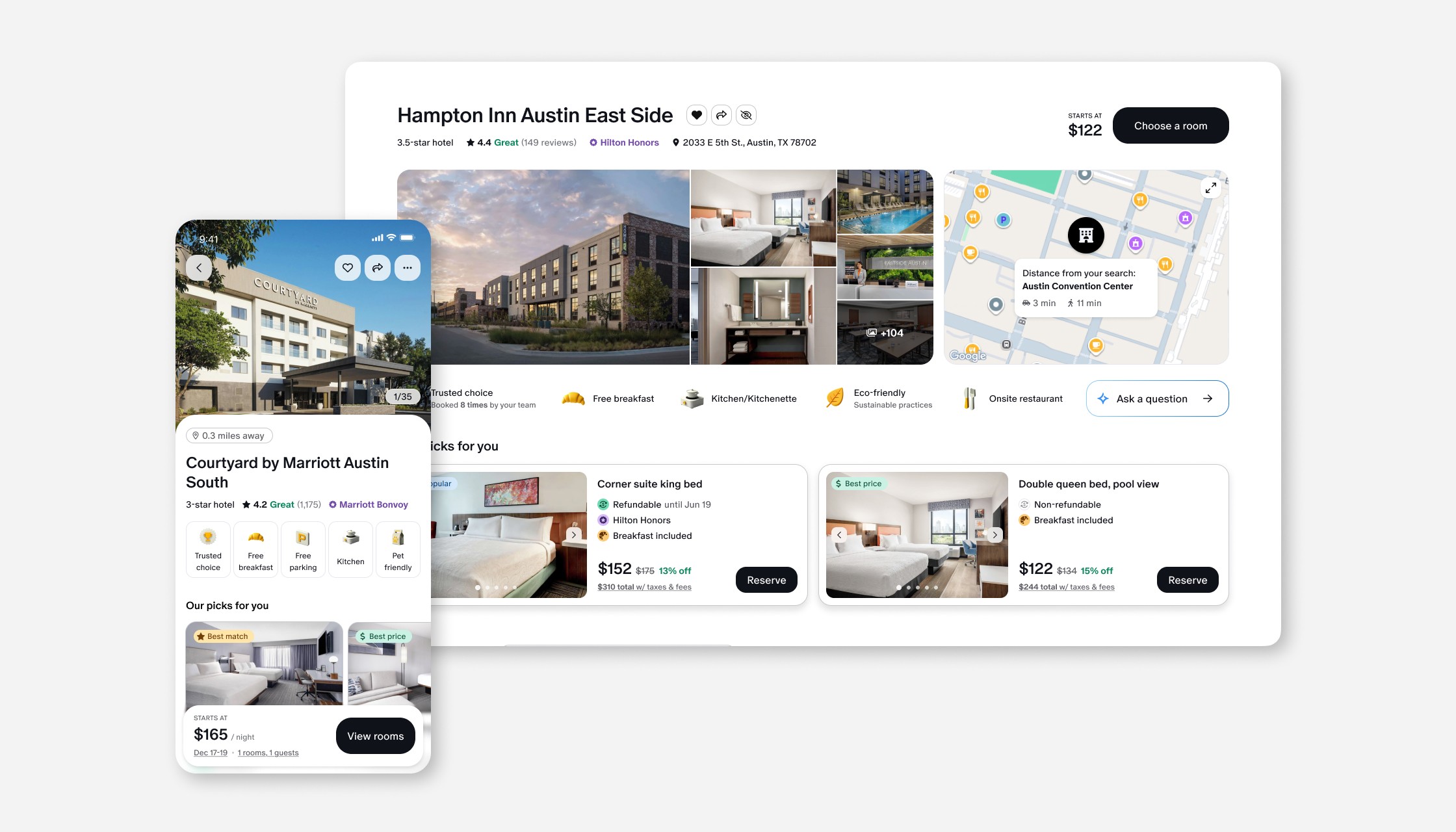
To design an effective property details page, I needed to answer two core questions on behalf of the user: Is this the right hotel for me? And if so, what is the right room? These became the guiding framework for the entire design — ensuring that everything above the fold was decision-critical, surfacing only the information needed to answer both questions with confidence.
Conduct a competitive analysis
I analyzed leading travel platforms including Expedia, Airbnb, Priceline, Kayak, Google, TravelPerk, Ramp and Navan, along with non-industry experiences like Zillow to identify common design patterns, surface what was working, and pinpoint where existing experiences fell short.
Identify the differences of leisure vs business travel
The competitive analysis revealed solutions optimized for leisure travel, but business travelers have distinct needs: they split between those who book premium accommodations freely on a company card and those who book conservatively out of budget anxiety. Unlike leisure travelers who explore new areas daily, business travelers repeatedly return to the same destination — making familiarity and efficiency far more important than discovery.
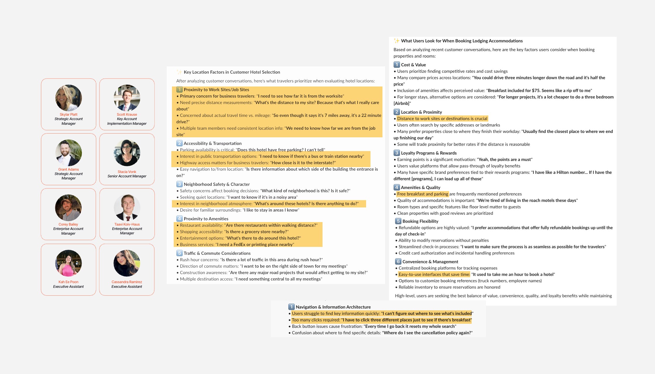
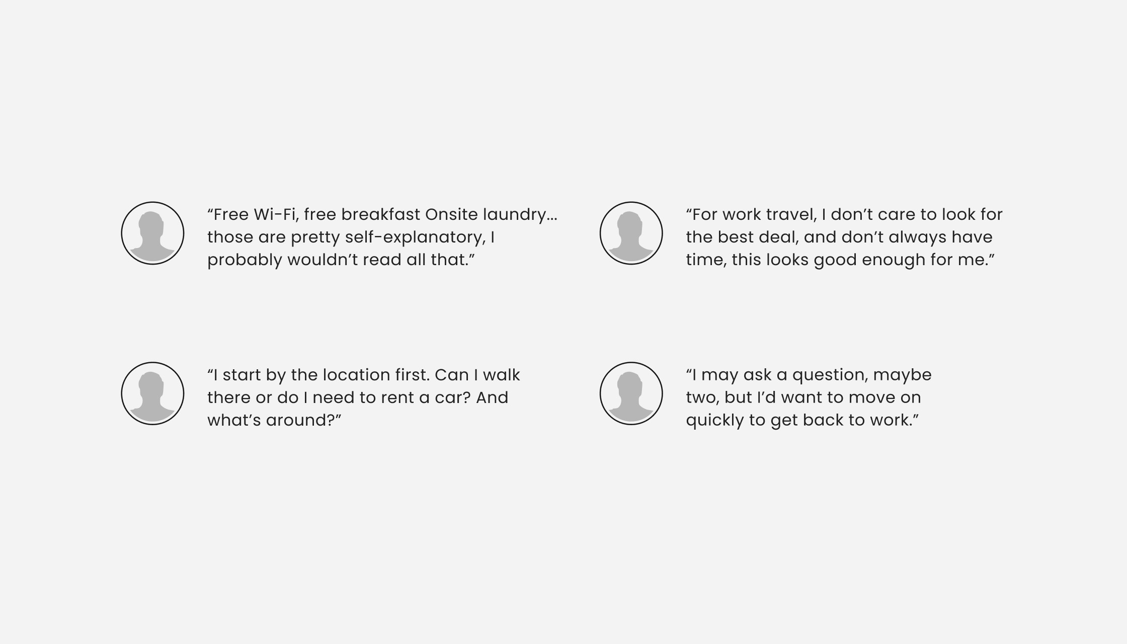
Interview account managers
To supplement my research with real-world context, I interviewed account managers who work directly with our B2B clients. Their insights surfaced key user pain points, recurring feature requests, and frequently asked questions — giving me a clearer picture of what business travelers struggle with and what they value most in a booking experience.
Design concepts

Analyze existing user behavior
Using LogRocket to observe real user sessions, I identified clear patterns: users consistently sought out free breakfast, free parking, and spent significant time browsing photos — all of which became decision-critical elements in my designs. I also noticed users frequently engaging with the map only to navigate off-platform entirely, signaling an opportunity to bring more of that location context in-house.
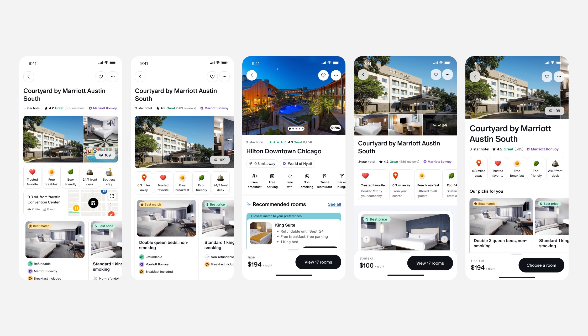
Explore layout directions
With the decision-critical framework established, I explored a range of layouts for both desktop and mobile — experimenting with full-width photography, bento-style grids, traditional stacked layouts, and sidebar approaches. Each exploration was evaluated through the lens of the business traveler, asking whether the layout surfaced the right information at the right moment to confidently answer both booking questions.
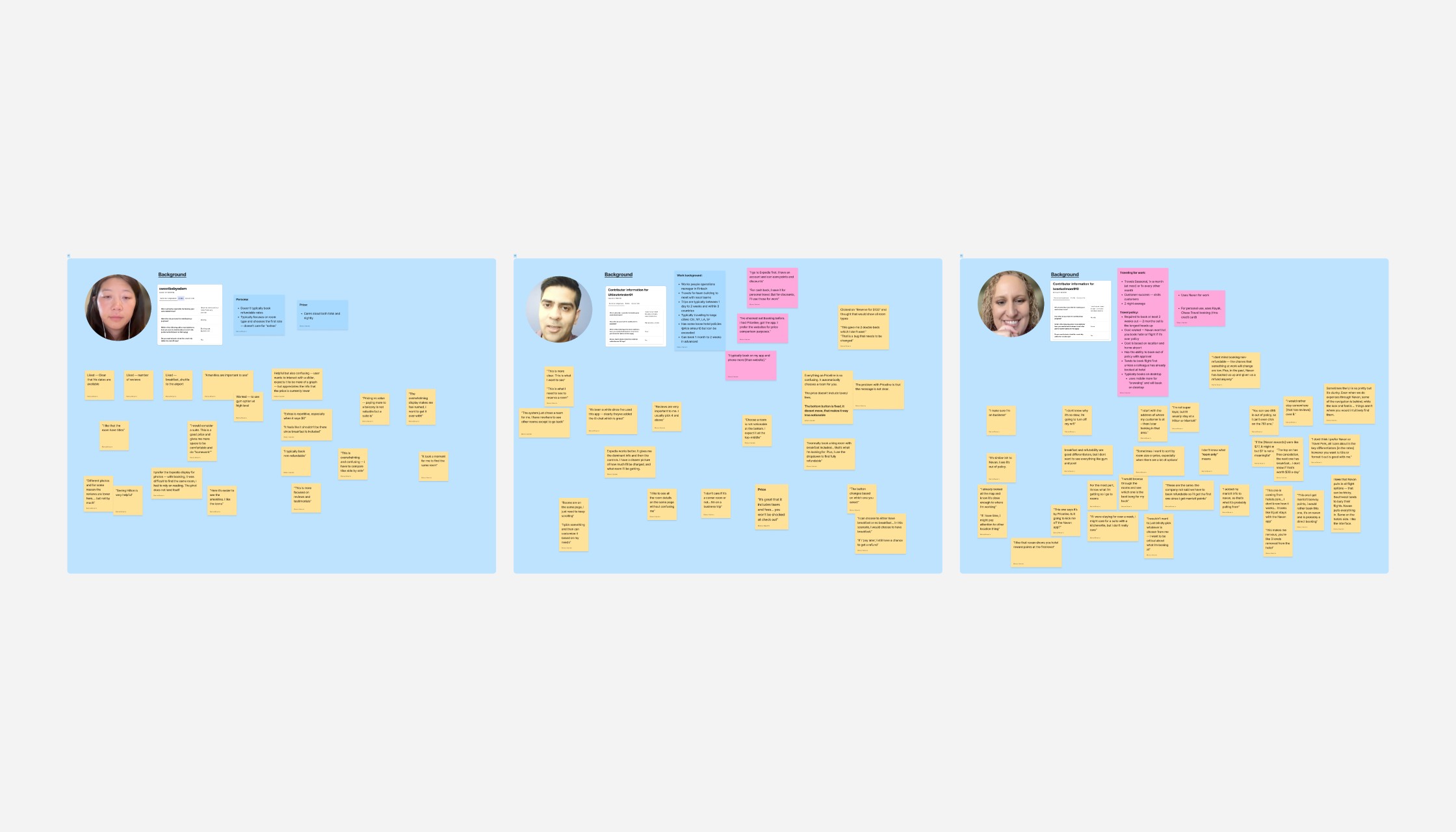
Test final concepts
With two strong design directions for each platform developed, I conducted user testing to evaluate each concept and understand which elements resonated most. Rather than identifying a single winner, the sessions revealed the strengths of each — informing a final concept that synthesized the best of both into one cohesive, validated design.
Launch MVP
Launch redesign experience
We launched the redesigned mobile and desktop experiences as A/B tests, measuring the new designs against the existing product. Grounded in account manager insights, user testing, and my own intuition as a traveler, both experiments showed a measurable uplift in conversion to checkout — validating the decision-critical design approach from the ground up.