I redesigned Rivian's purchase experience, reducing user confusion, improving efficiency, and earning an award from Qualtrics for product design excellence

Discovery and definition
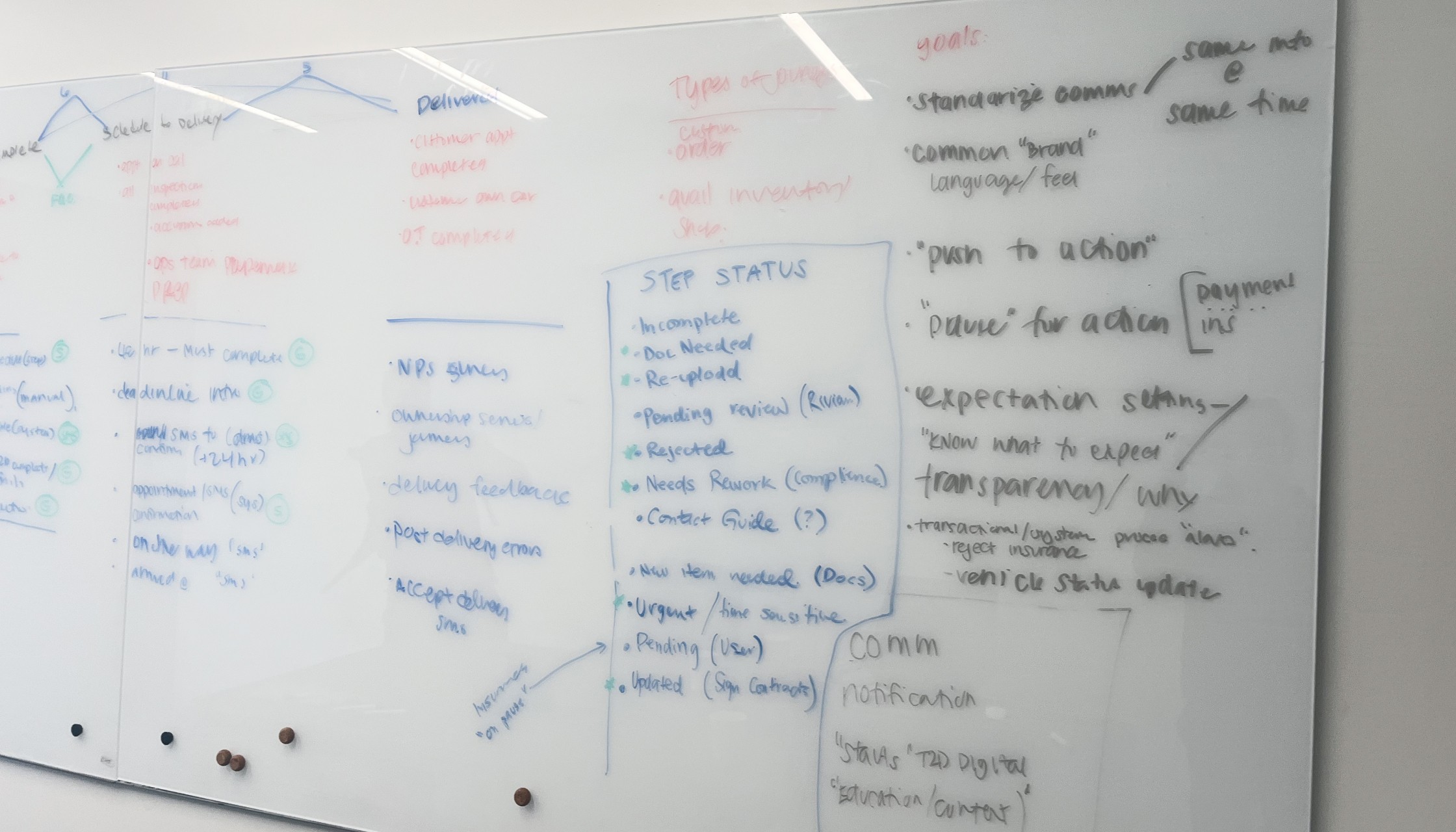
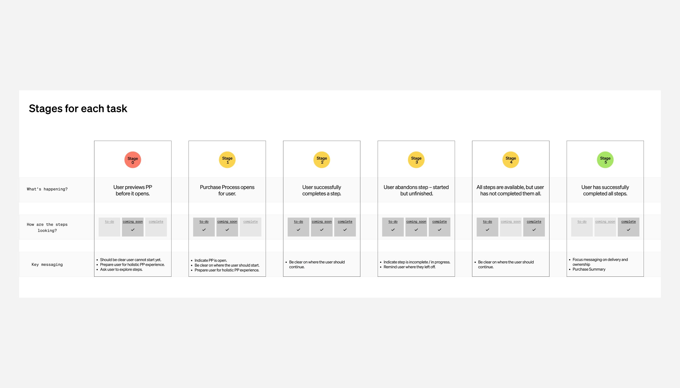
Outline step dependencies
We started with what we knew and outlined step dependencies as user stages. This helped us understand the phases a user would be in and what task they needed to accomplish vs. ignore, making sure we outlined key messaging for each stage.
Stakeholder interviews
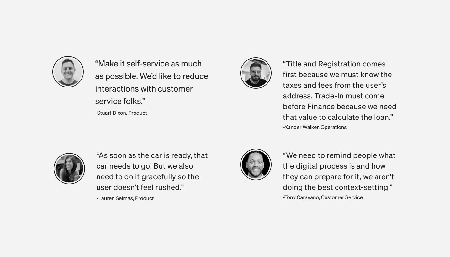
Simultaneously, we held weeklong stakeholder interviews to gain insight on what is working and not working for our operational teams – who are our experts on the ground. This also helped us understand the future of the business so we could future-proof our design.
80%+ of sessions come from a desktop device – the new experience should not be designed mobile-first as the previous design was.
We understood and outlined the dependencies each step had – what task needed to come before another task, including key messaging for the user at each stage.
We outlined gaps and redundancies in the communication journey.
We learned customers have a deep desire for educational content so they feel confident and prepared.
Competitive analysis
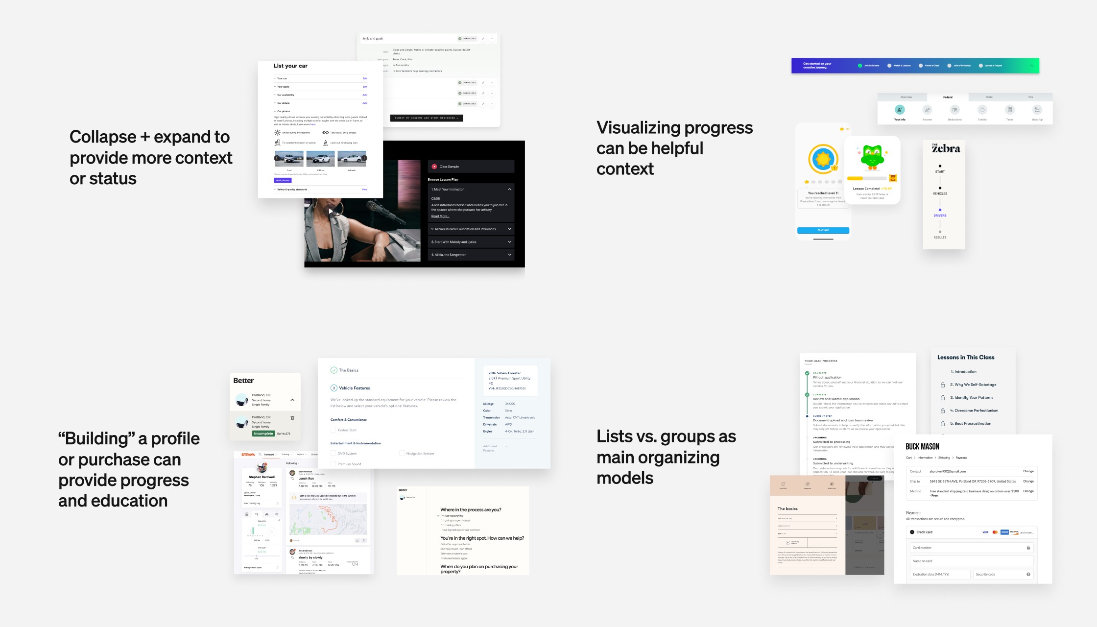
With a thorough competitive analysis of industry and non-industry competitors, we were able to find and categorize ux patterns that could work for our product. These findings helped us analyze and experiment with similar patterns that could work for our experience and users.
Ideation and design
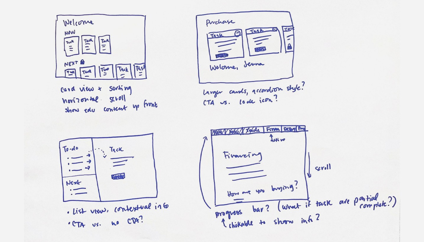
Rapid design explorations
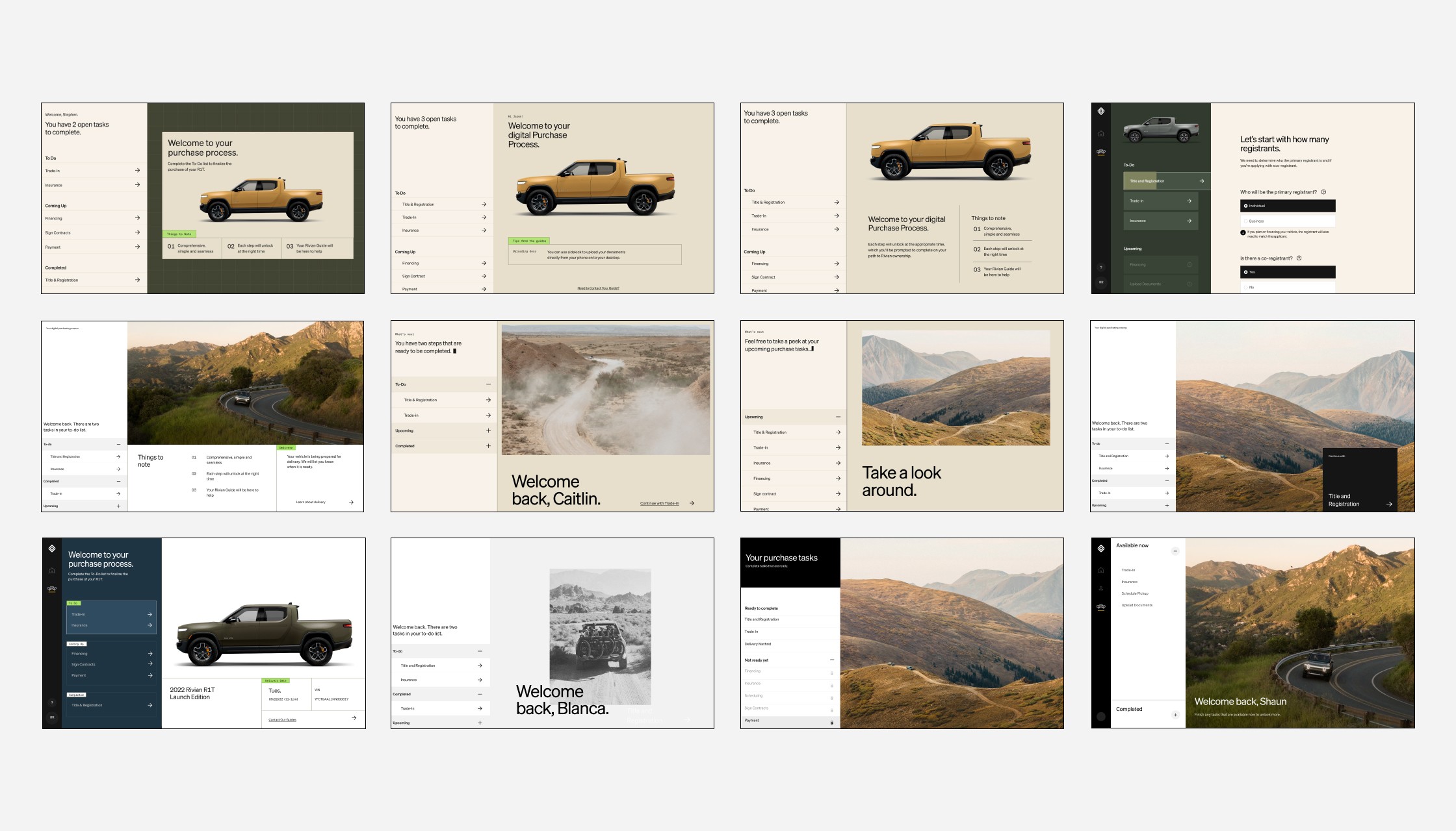
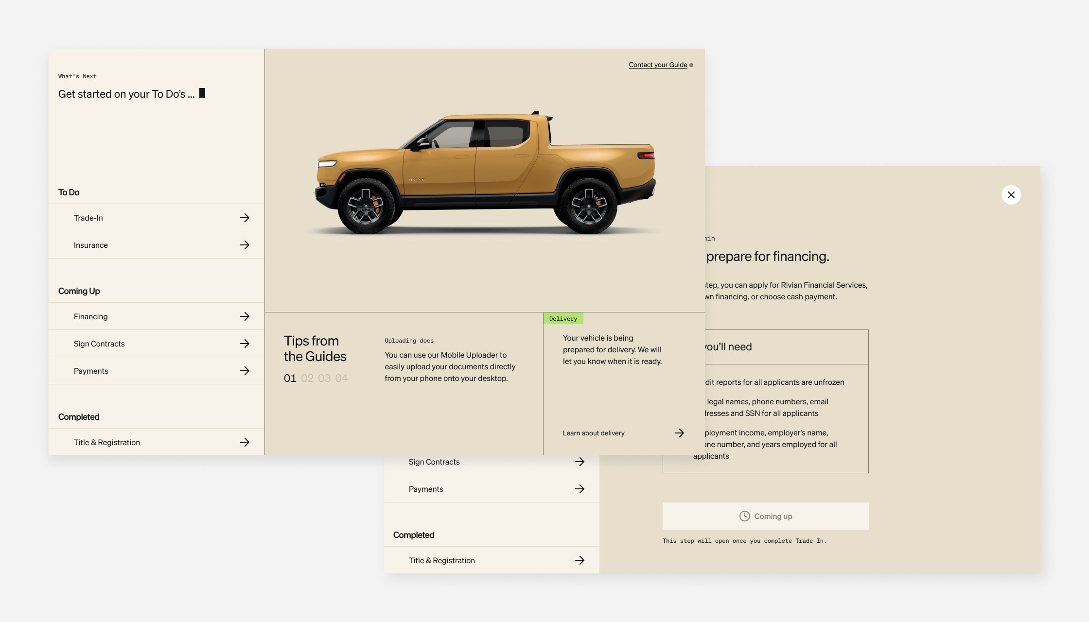
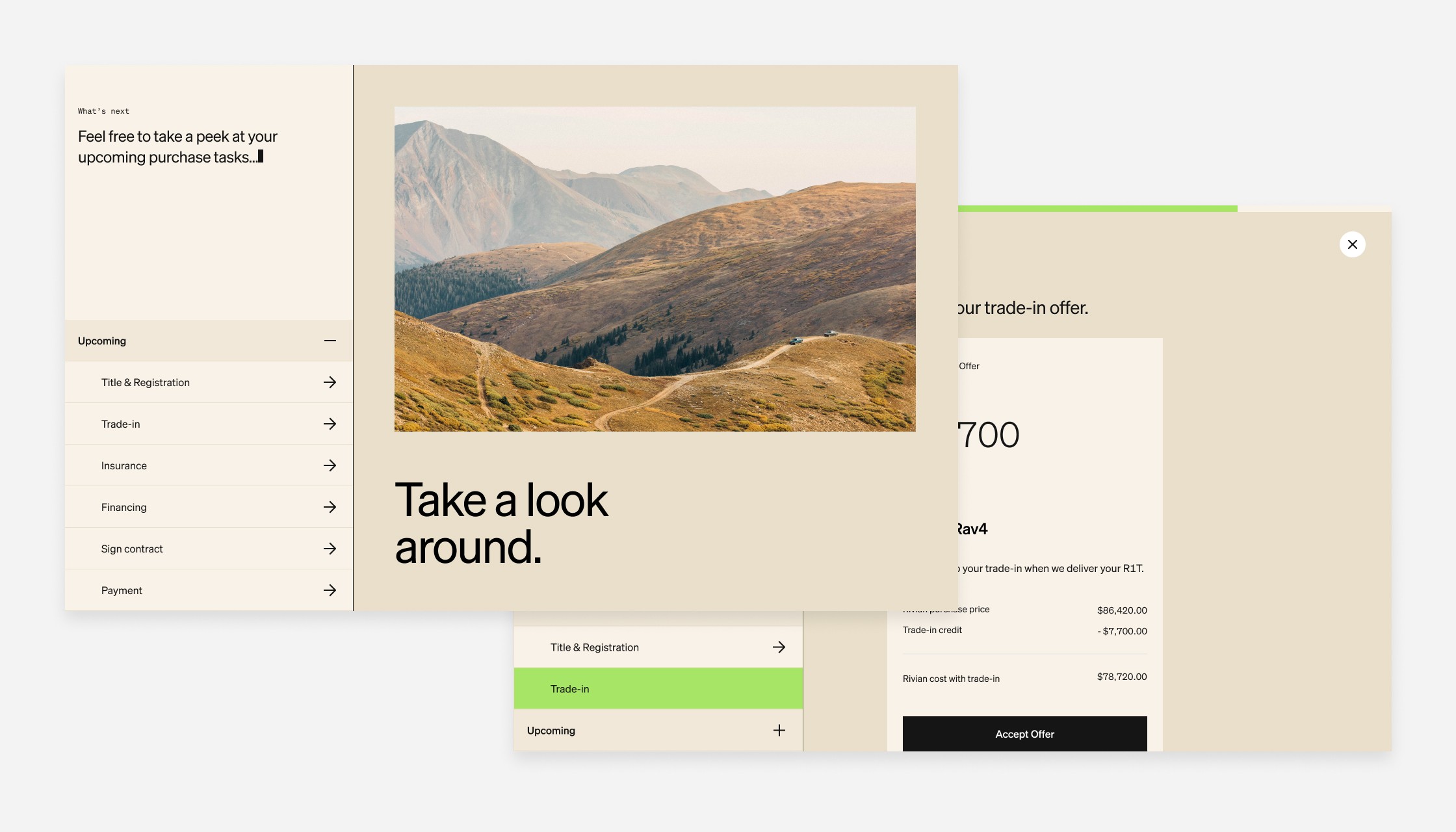
With a clear understanding of our problem and user needs, we outlined several low fidelity iterations with different architectural information strategies. We considered lists vs. cards vs. sections and explored possible loading and locked iconography.
Questions for testing
Do users understand what it means when a task is "locked?"
Do users understand what they're supposed to do at any given moment?
Do users prefer cards, lists, accordion or sectional layouts? What is the clearest?
Does a progress bar help or hurt users?
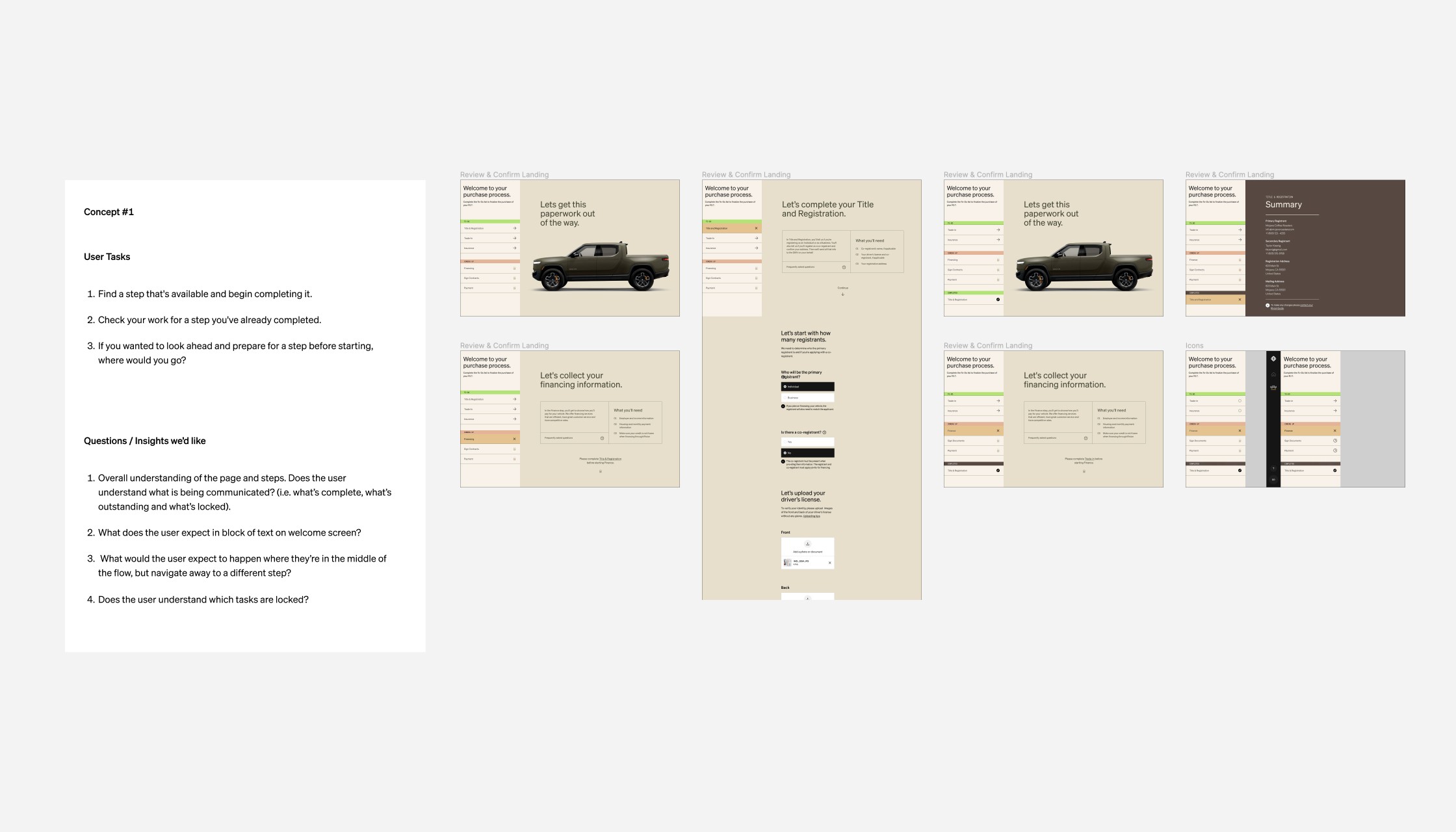
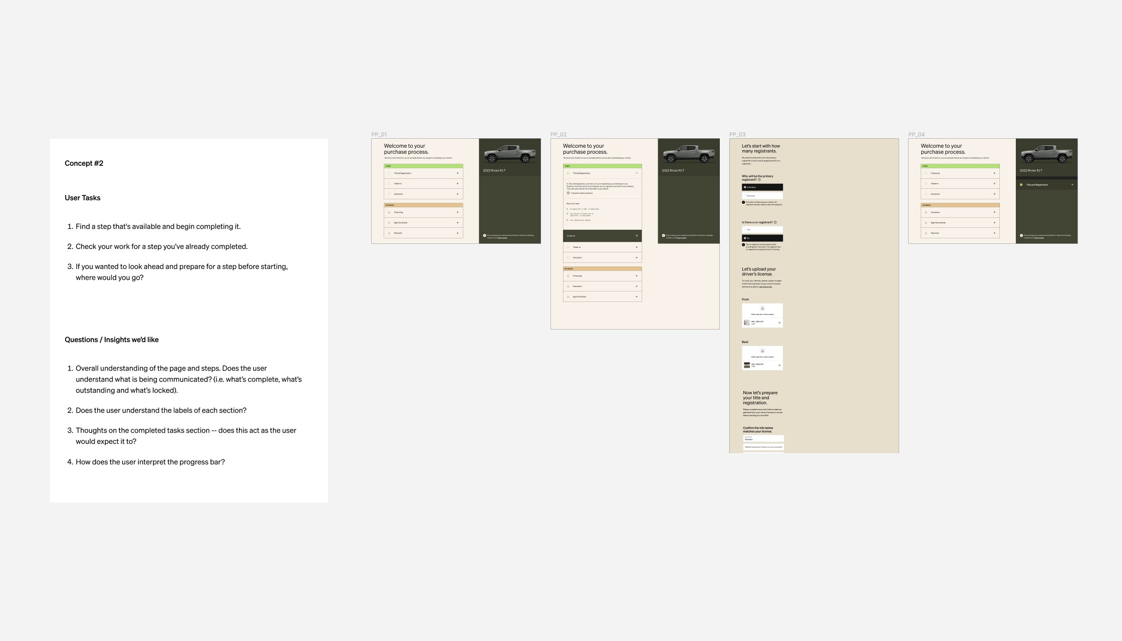
Test and iterate
Test, improve, repeat
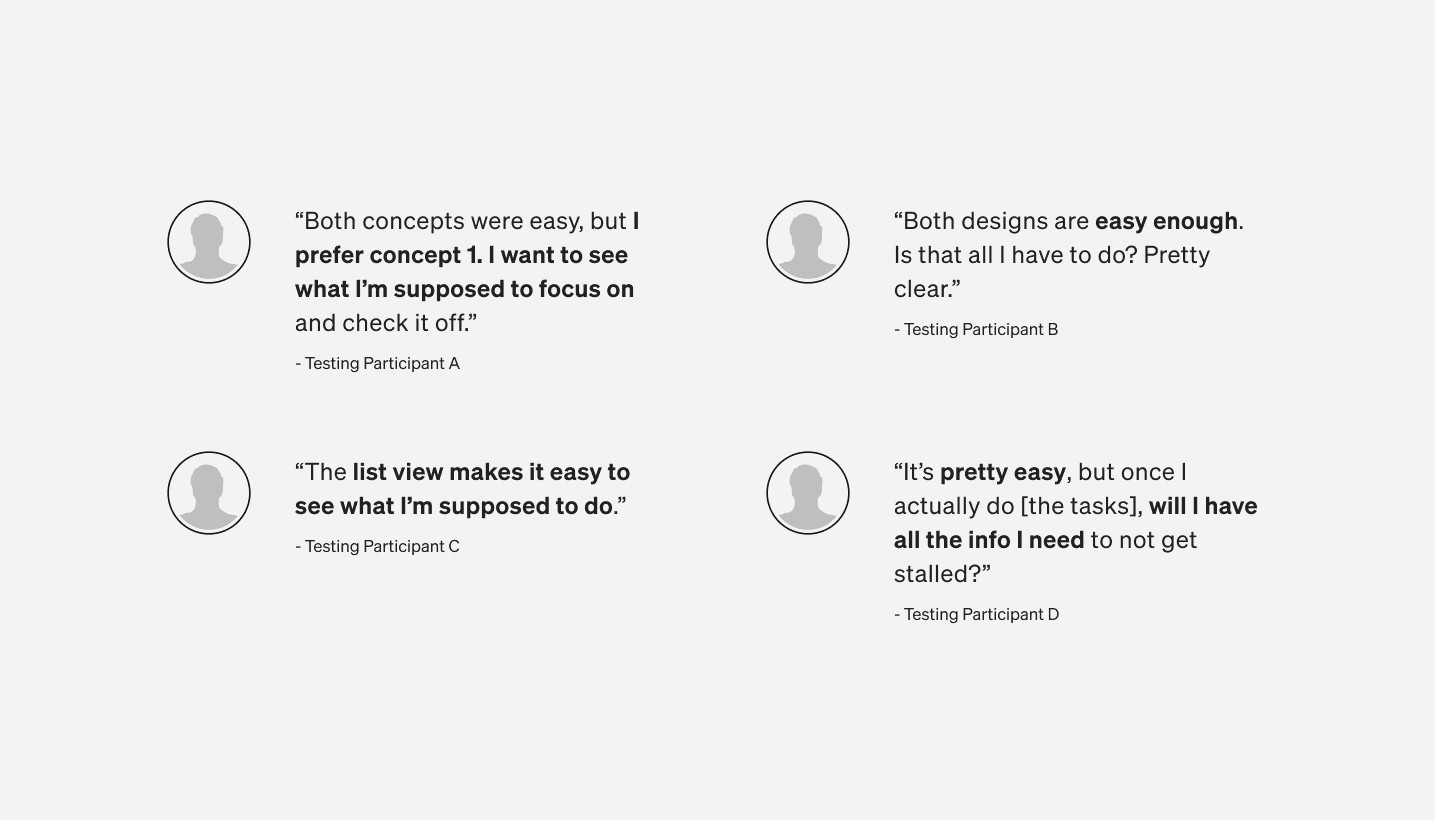
We tested two early ideas with the goal of gathering interpretations of the design intent and learning about user preferences. When we heard more than two users say the same thing, we quickly improved the prototype and continued testing. This allowed us to rapidly gain insights and experiment with improvements. We used research and our best judgment to get closer to the right solution.
Key learnings
👍 Users easily completed tasks with both concepts.
👍 Both concepts earned an NPS score of 89 and 89.5.
👍 Users preferred a list view for clarity.
👍 Users enjoyed educational content at the start of each task.
👎 Users misinterpreted the lock icon in many ways.
👎 Users clicked on disabled buttons not knowing they're disabled.
👎 Users were distracted by image renderings of the vehicle.
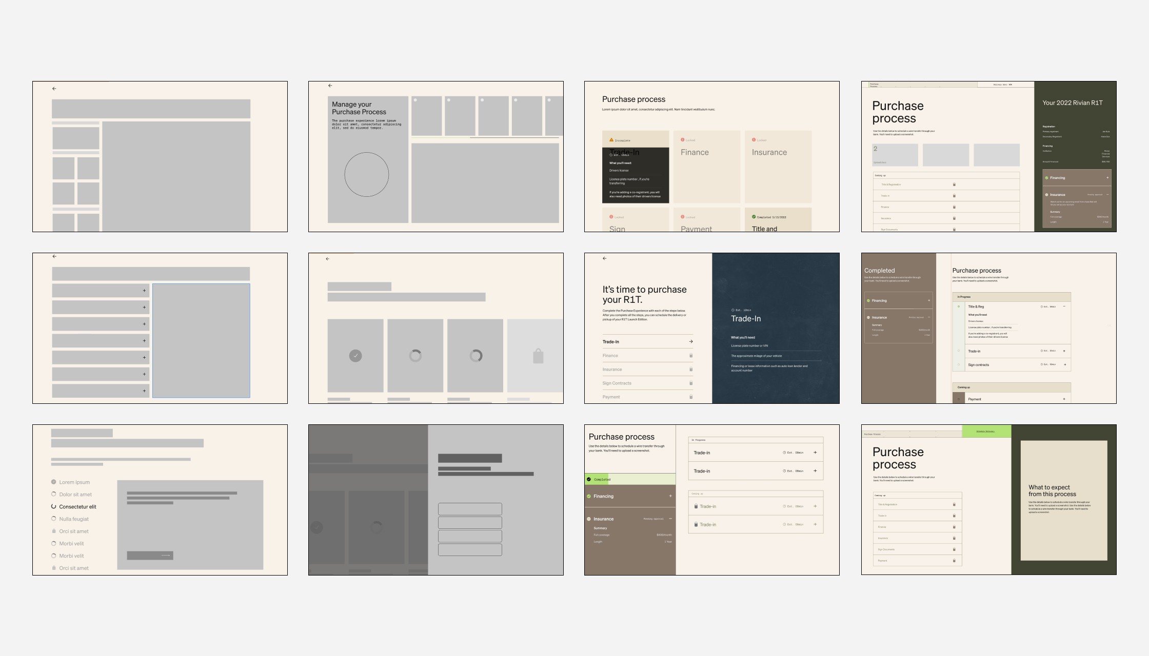
Visual explorations
High-fidelity design explorations
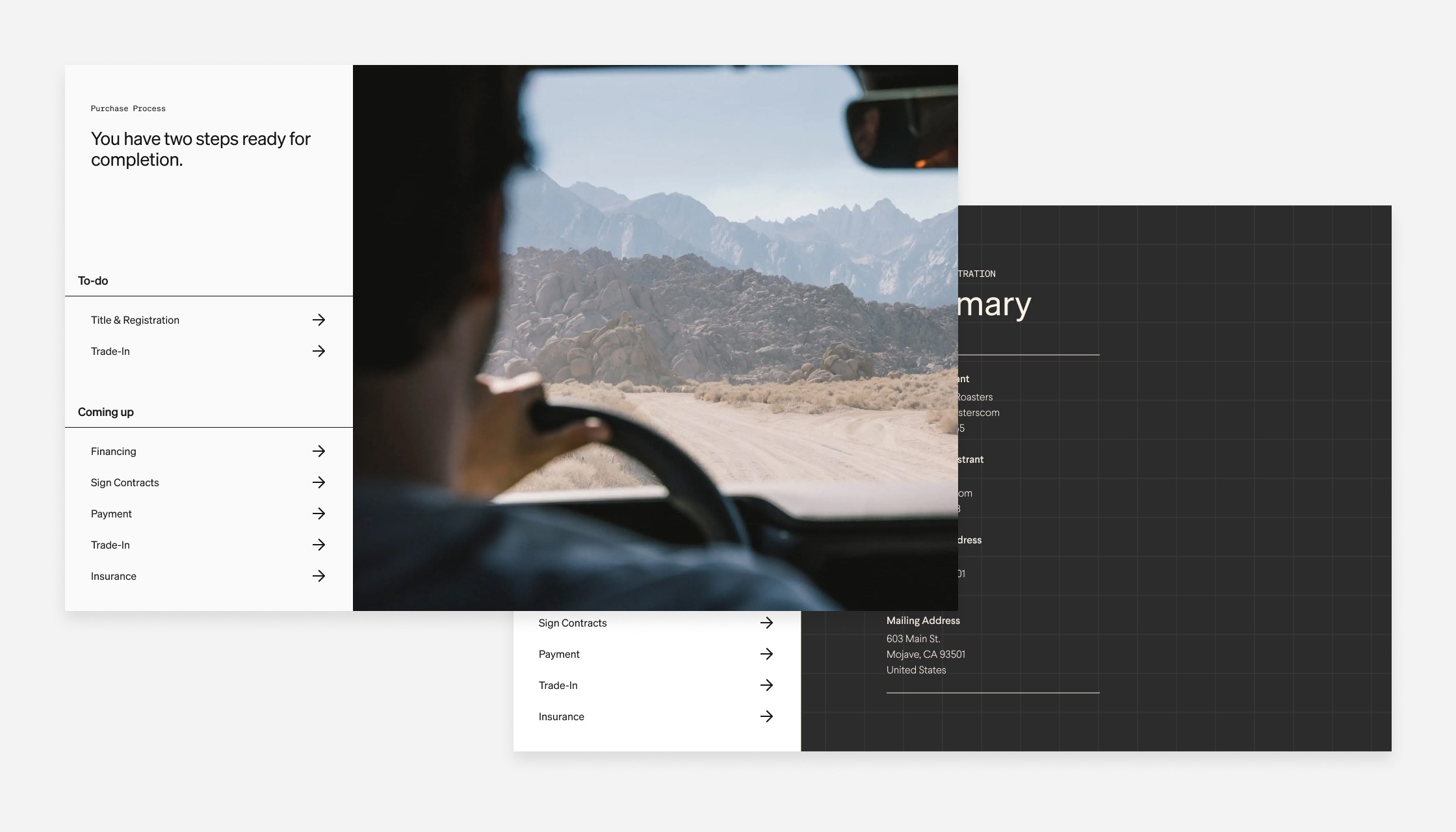
Our testing results proved a list view was working effectively for users. By this time, I lost my team due to a reduction in workforce and it was up to me to give life to our design explorations and take the concept to the finish line.
I developed an additional 10+ design concepts and worked with my director and brand system designer to future-proof the design.
A new design system
During this time, our larger team was experimenting with a possible new design system which included round border radiuses, a new typeface and a more conservative approach to color. These visual explorations required rigorous iterations that helped influence our final design system.
Refine and validate
Concept validation
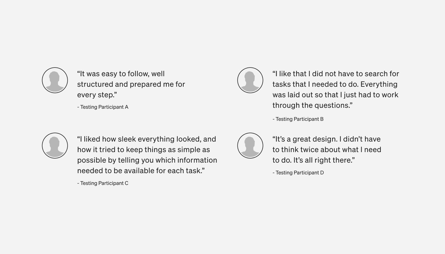
One of the final steps in my process was to bring the final design concept into user-testing to validate theories, design decisions and copywriting choices. The goal was to gather final insights and feedback to improve the design before hand-off.
Key learnings
👍 Final concept earned an NPS score of 100.
👍 All users were able to complete an open task and understand what tasks are locked/unavailable.
👍 All participants used the words like "easy," "straight-forward," and "simple."
👍 No user had issues completing a task or comprehending next steps.