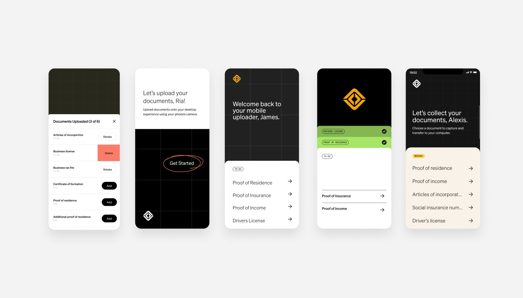
I designed a tool that enables mobile to desktop document uploads, solving our most laborious user challenge


My role
UX strategy and design
UI design
Copywriting
Prototyping
Presentation
Team
Front-End Engineers
Back-End Engineers
Lead UX Researcher
Stakeholders
Director, UX Digital Design
Senior Product Manager
Background
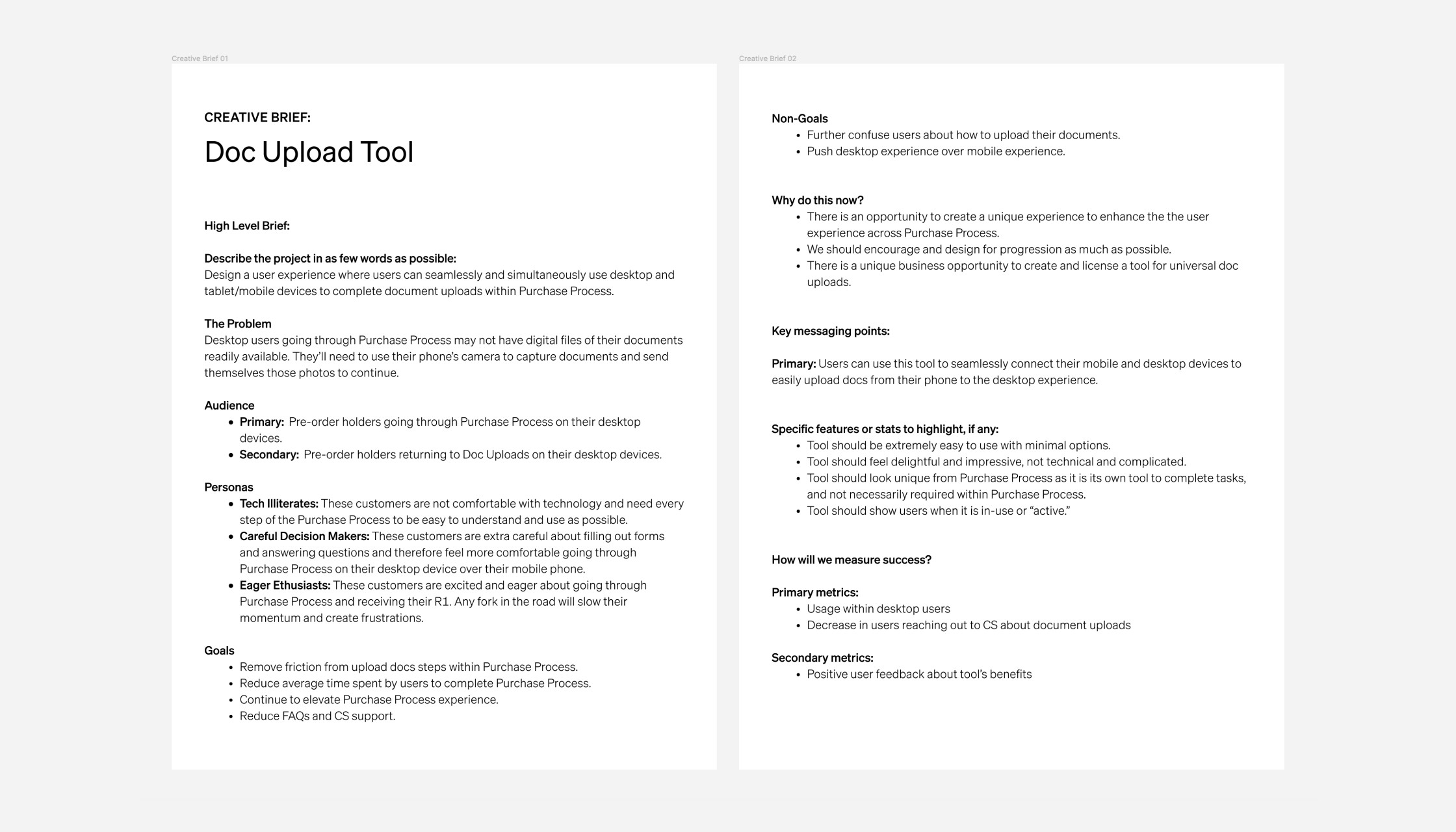
Rivian customers were forced to use their phone's camera to capture and send document photos to continue their purchase, causing frustration and delays.
Goals
Remove friction from upload docs steps
Reduce time spent by users to complete purchase
Reduce FAQs and CS support
Discovery and definition
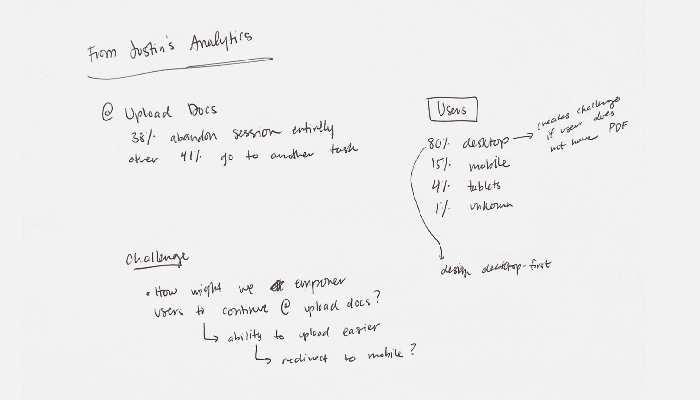
Site analytics discoveries
After syncing with our digital analytics team, I learned over 80% of users make their vehicle purchase using a desktop device. Additionally, almost 38% of users were abandoning sessions at the upload documents step.
Deeper understanding of the problem
Data from the analytics indicated users were unprepared and unequipped to move forward when asked to upload required documents.
To solve this problem, I identified the benefits of mobile devices (the ability to take photos) and the reason users preferred desktop devices. My solution had to include the benefits of both to allow users to progress.
Outline project goals
With a thorough competitive analysis of industry and non-industry competitors, we were able to find and categorize ux patterns that could work for our product. These findings helped us analyze and experiment with similar patterns that could work for our experience and users.
Ideation and design
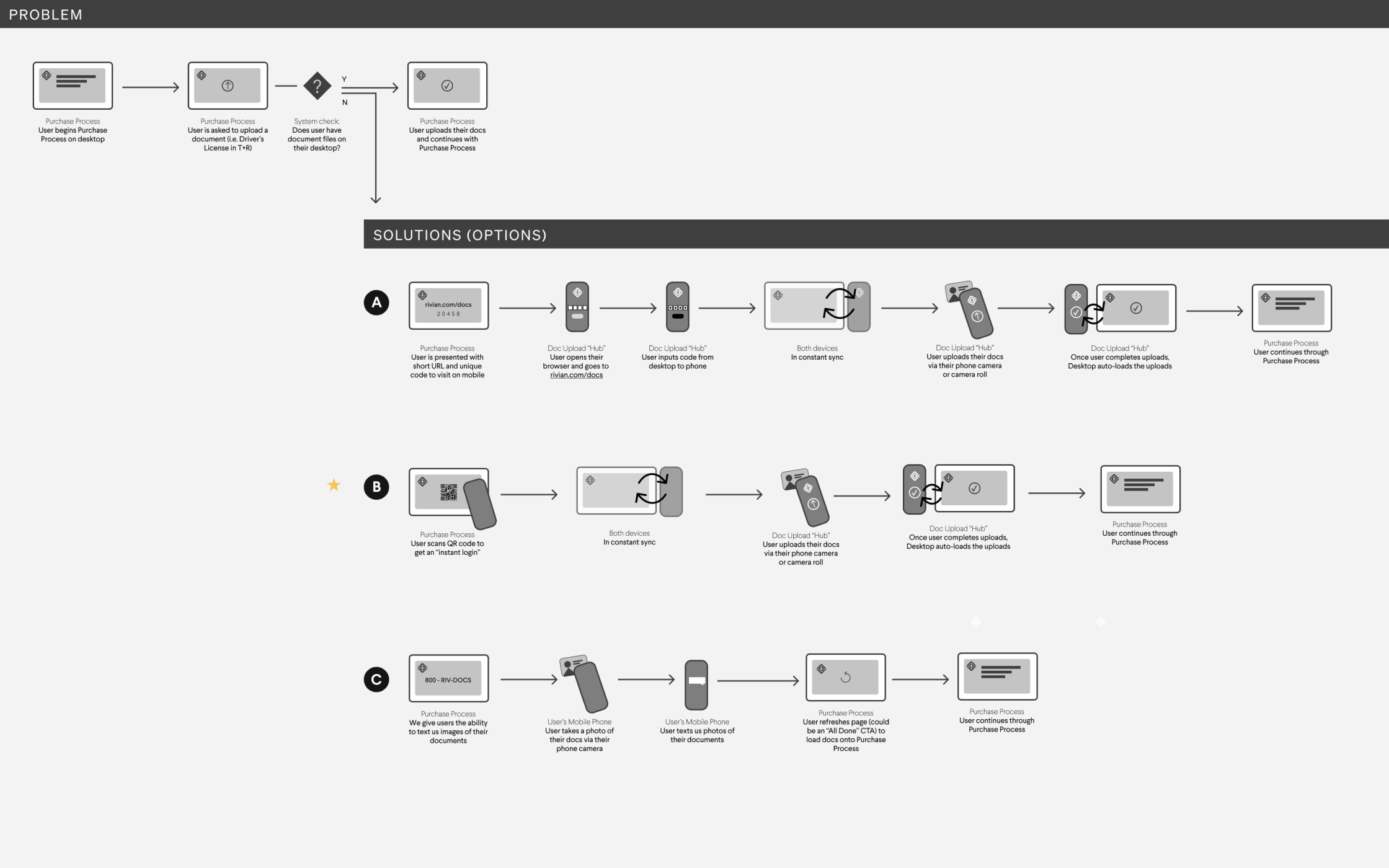

Multiple solutions
With an understanding of engineering possibilities and constraints, I outlined possible user journeys and solutions. Then, I chose the most optimal solution and recommended the direction to my stakeholders through presentation.
Focusing on the core of the solution, I begin with low-fidelity designs to strengthen the functionality of my chosen intent.
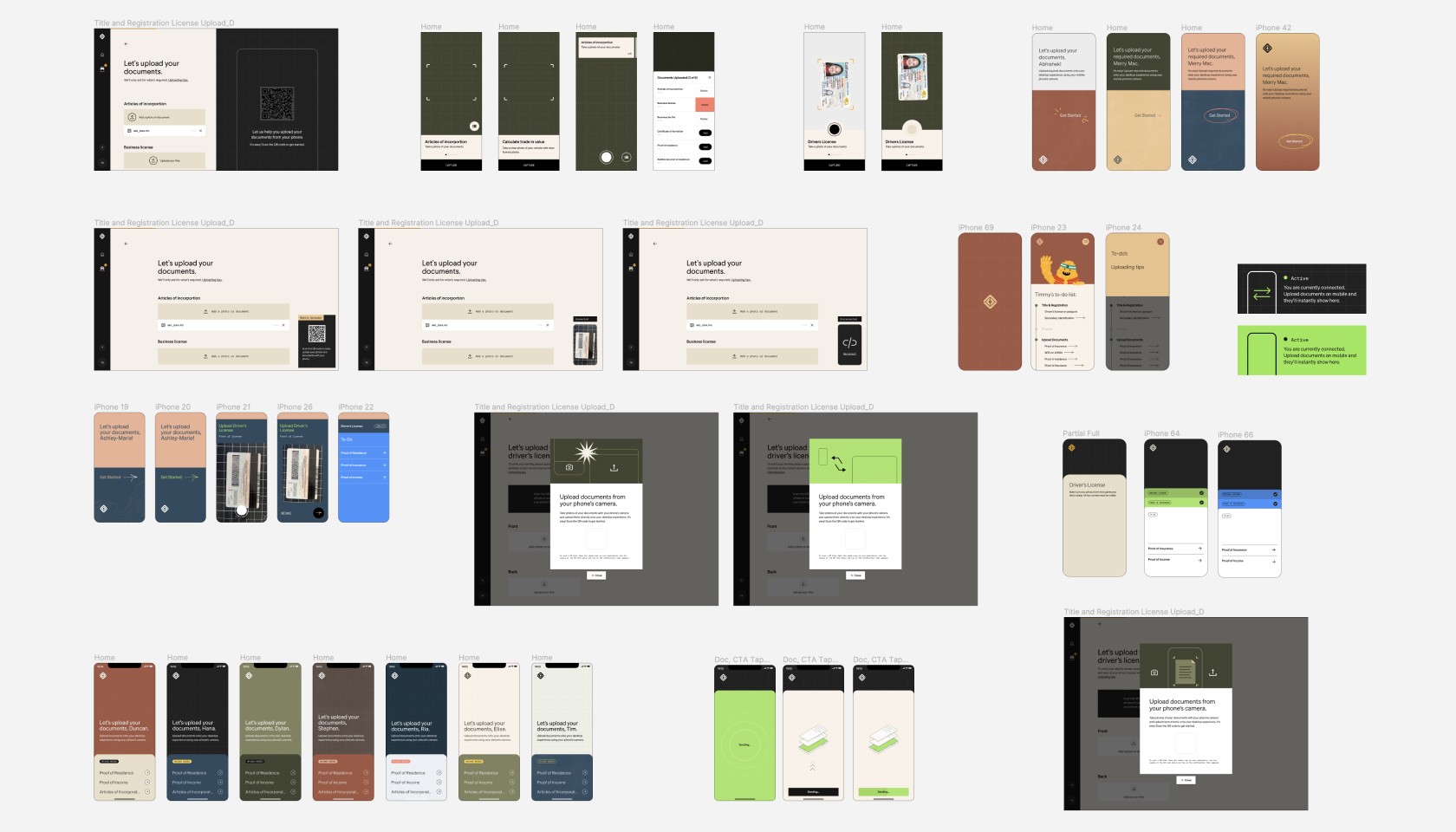
Visual explorations
Test, improve, repeat
As a net new product, the visual design opportunities were (somewhat) endless. The product could have a standalone look and feel, but it needed to feel adjacent to the larger experience. My team and I explored a wide range of design options that both fit within our system but pushed its limits.
Validate final concept
Concept validation
The design was tested to ensure comprehension and usability. The goal was to validate decision designs and understand if users were actually interested in using the tool. Additionally, we gathered final copy feedback before handing off to our engineering partners and launching.
Key learnings
👍 Final concept earned an NPS score of 88.
👍 All users understood how to use a QR code with no assistance.
👍 All users uploaded at least 2 documents with no assistance.
👍 Many participants used phrases like "easy to use" and "delightful."